Guide to Adding a Textbox
Less than to read
In this guide, we will walk through the process of adding a Textbox component to the New Customer and Amend Customer screens in Sage 200.
We will define the necessary UI extension, configure its properties, and position it on the screen using the onLoad event.
Let’s begin with the full JSON structure that includes the necessary configurations:
Now, let’s break down each section of the JSON:
Section 1: Version
The “version” section within the schema serves as an indicator of the schema version being used, ensuring compatibility and facilitating tracking of changes over time.
As the schema evolves, different versions may emerge, such as 1.0 and 2.0. It is important to note that when employing version 1.0, any new features introduced in version 2.0 or subsequent versions will not be accessible. By explicitly specifying the version in the “version” section of the schema, you can uphold consistency and effectively manage schema updates.
By adhering to a specific schema version, you ensure that your implementation aligns with the defined features and structure, providing stability and predictability in your development process.
JSON:
{
  "version": "1.0",
  ...
}
Section 2: Pages
To begin, you need to browse to the relevant page in Sage 200 where you want to add your component. Take note of the URL for that page. For example, if you want to add the component to the “New Customer” page, the URL might be:
https://app.sage200.co.uk/Sage200WebPortal/app/sales/new-customer
From this URL, we extract the relevant page identifier, which in this case is “sales/new-customer”. This identifier will be used in the “pages” section of our JSON configuration.
The “pages” section is an array that lists the screens that you require your component to be included on. In our case, we include the relevant page identifiers we extracted from the Sage 200 URLs. For example, “sales/new-customer” and “sales/amend-customer” represent the New Customer and Amend Customer screens in Sage 200.
JSON:
{
  ...
  "pages": [
    "sales/new-customer",
    "sales/amend-customer"
  ],
  ...
}
Section 3: UI Extensions
The “uiExtensions” section allows us to define custom UI components. Within this section, we can add multiple UI extensions, each represented as an object. Each UI extension object consists of an “id” and a “component” list, where we can define the properties and behaviour of the specific component.
For our guide, we will be using the Textbox component. However, you can list various other components, such as Buttons, Grids, Dates, and even Pods. Each component has its own set of properties and functionalities.
In our example, let’s focus on the Textbox component:
JSON:
{
  ...
  "uiExtensions": [
    {
      "id": "spareTextField1",
      "component": [
        {
          "Textbox": {
            "id": "spare_text_1",
            "label": "Spare Text 1 Textbox",
            "disabled": true,
            "mt": 2
          }
        }
      ]
    }
  ],
  ...
}
The “id” property of the uiExtension is set as “spareTextField1”. This serves as a unique identifier for the UI extension component. You can choose any meaningful and unique ID for your component.
The “component” property is an array that contains the specific UI component we want to add. In this case, we are using the “Textbox” component. Within the “component” array, we have an object that represents the properties and configuration of the Textbox component. The properties we are setting in this example are:
-
The ‘id’ property serves as a unique identifier for this component. You have the flexibility to set it to your preferred value, or you can align it with a corresponding Sage 200 field. In this particular instance, we are configuring it as ‘spare_text_1.’ Consequently, when the screen is saved, the content within this textbox will be mapped and stored in the ‘spare_text_1’ field of this particular customer record.
-
The “label” property is set as “Spare Text 1 Textbox”. This label will be displayed adjacent to the Textbox, providing a description or indication of what information should be entered.
-
The “disabled” property is set to “true”, which means the Textbox component will initially be disabled. Users won’t be able to interact with or enter any value into the field until it is enabled. You can enable components using events or actions, which we will explore in later sections.
-
The “mt” property represents the margin-top positioning of the Textbox component. In this example, the value “2” is used, which corresponds to a margin-top of 16 pixels. The numeric values follow a specific spacing convention in Sage 200, where each unit represents 8 pixels. Using these values ensures consistent alignment with other fields and allows for easy adaptation to any future adjustments in the standard field positions.
Feel free to explore other available UI components and their respective properties in the documentation to customise your application further.
Section 4: Actions
The “actions” section is currently empty, indicating that no specific actions or behaviors are defined for our UI extension. We can use this section to define additional actions if needed.
JSON:
{
  ...
  "actions": {},
  ...
}
Section 5: Validations
The “validations” section is empty, implying that no specific data validation rules or conditions are defined for our screen fields.
JSON:
{
  ...
  "validations": [],
  ...
}
Section 6: Events
The “events” section allows us to specify actions or operations triggered by specific events within our application.
In the JSON, we have three events being triggered: two onLoad events and an onStateChange event. Let’s break down each event:
Add Components to the Screens
To begin, we define the onLoad event to trigger an action when the page loads. Within this event, we use the “set” action to position our UI extension component on the screen.
The following properties are set within the onLoad event:
- The “componentId” property is set as “short_name”, indicating that our UI extension component will be associated with the “short_name” field on the screen.
- The “panel” property is set as “bottom”, which means our UI extension component will be positioned below the “short_name” field.
- The “uiExtension” property is set as “spareTextField1”, referring to the ID of our UI extension defined in the “uiExtensions” section.
{
  ...
  "events": [
    {
      "onLoad": [
        {
          "set": {
            "pageExtension": {
              "componentId": "short_name",
              "panel": "bottom",
              "uiExtension": "spareTextField1"
            }
          }
        }
      ]
    }
  ]
  ...
}
Enable Textbox on New Customer Screens
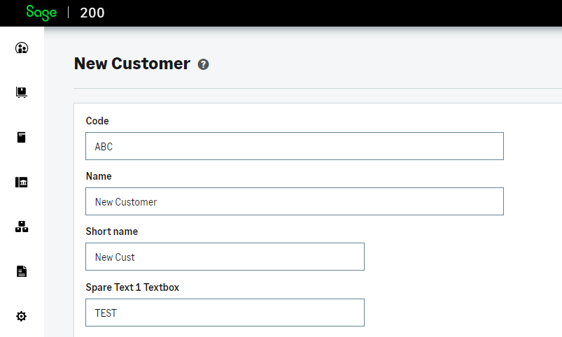
Next, we use the onLoad event again, but this time it only triggers when the “sales/new-customer” page loads. We achieve this by including the page name in our event object. Once the onLoad event is triggered, it uses the “set” action to modify the properties of the UI extension component. Specifically, the “properties” object is set to update the “disabled” property of “spare_text_1”.
By setting the “disabled” property to false, it allows interaction with the UI component. This ensures that on the “new-customer” page, the “spare_text_1” component is not disabled by default, enabling users to interact with it.
...
{
  "pages": [
    "sales/new-customer"
  ],
  "onLoad": [
    {
      "set": {
        "properties": {
          "spare_text_1": {
            "disabled": false
          }
        }
      }
    }
  ]
},
...
Enable Textbox on Amend Customer Screens
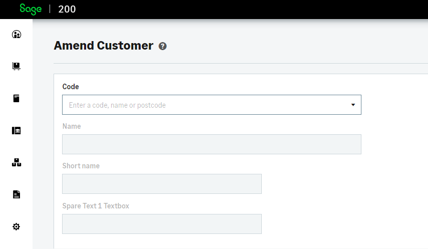
Unlike the new customer screen, the amend customer screen has the majority of its fields disabled until a customer is selected. Initially, the disable property is set to false on our textbox. However, once a customer is selected, the textbox remains disabled. To address this issue, we utilise the onStateChange event.
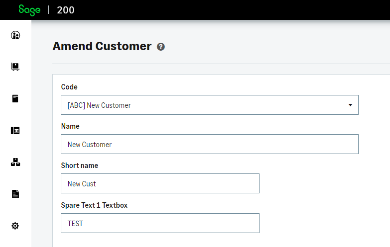
The onStateChange event triggers when the state of the page with “sales/amend-customer” changes. It watches the “id” target for changes. The “onChange” action is used to handle changes in the “id” state. The condition is checked using “gt” (greater than) to compare the “id” state against the value 0, as we know that the id will be greater than 0 when a customer is selected.
If the condition is true (the “id” is greater than 0), the “then” block is executed. Inside the “then” block, the “set” action is used to modify the properties of spare_text_1. The “properties” object is set to update the “disabled” property of “spare_text_1”. By setting the “disabled” property to false, it enables interaction with the UI component. This ensures that the “spare_text_1” textbox follows the same behaviour as other textbox’s on the page, where they are enabled for user interaction.
If the condition is false (the “id” is less than or equal to 0), the “else” block is executed. Inside the “else” block, we do the same thing as the “then” block but set the “disable” property to true. By setting the “disabled” property to true, it disables the UI component or keeps it disabled.
...
{
  "pages": [
    "sales/amend-customer"
  ],
  "onStateChange": [
    {
      "watchTarget": "id",
      "onChange": [
        {
          "if": {
            "gt": [
              {
                "get": {
                  "state": "id"
                }
              },
              {
                "string": {
                  "value": "0"
                }
              }
            ],
            "then": [
              {
                "set": {
                  "properties": {
                    "spare_text_1": {
                      "disabled": false
                    }
                  }
                }
              }
            ],
            "else": [
              {
                "set": {
                  "properties": {
                    "spare_text_1": {
                      "disabled": true
                    }
                  }
                }
              }
            ]
          }
        }
      ]
    }
  ]
}
Remember to start and close the JSON with curly braces { }.
By following these steps, browsing to the relevant page, and Utilising the provided JSON structure, you can successfully add the Textbox component to the New Customer and Amend Customer screen in Sage 200.
Utilising the Sage 200 API
When we created the textbox in the uiExtensions, we assigned it the ID “spare_text_1”.
 {
          "Textbox": {
            "id": "spare_text_1",
            "label": "Spare Text 1 Textbox",
            "disabled": true,
            "mt": 2
          }
        }
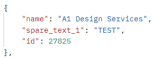
Any data entered into this field will be stored against the “spare_text_1” field in Sage 200. For example, if you create a new customer and enter a value in this field, it will be associated with that customer and will appear when you load the customer in the amend customer screen.
Additionally, the information can be retrieved through the Sage 200 API. If you make a GET request for a customer, the data entered in the screen will be returned.
When configuring the ID for the textbox within your application, you have the freedom to assign any desired value. However, if you want it to be associated against a Sage 200 field then it’s important to ensure that the ID is set to the corresponds Sage 200 field. This alignment allows you to perform operations like GET, PUT, POST, or DELETE on the value entered in that field through API requests.
Hopefully this breakdown helps you working with Textbox’s and provides a greater understand of each section of the JSON format.