Build your first customisation
Less than to read
Now we understand how to customise web screens, work with the schema and how to deploy extensions, lets start building a new customisation.
In this walkthrough we’ll look to add a new textbox to the new and amend supplier screens, that allows us to add a nick name to each supplier. We will store the data in the spare_text_1 field of each supplier object.
Navigate to the Web extensions screen, and click Add.
We are presented with a new schema template:
{
  "version": "1.0",
  "pages": [],
  "uiExtensions": [],
  "actions": {},
  "validations": {},
  "events": []
}
At this stage we don’t need to change the version so leaving it at 1.0 is fine.
Next we will select the pages we want the customisations to appear on.
Pages
As we want this customisation to appear on both the new and amend supplier screens, we need to add the identifiers from the page url for each:
{
  ...
  "pages": [
    "purchase/new-supplier",
    "purchase/amend-supplier"
  ],
  ...
}
Now to add the text box component.
UI Extensions
Using the UI Extensions section we can define our textbox component. We will give it an id, of Nickname and specify the component type of Textbox, and bind it to spare_text_1 on the supplier object. Specifying a label will add a label next to the textbox keeping the component in the same style as the rest on the screen.
In its default/initial state we would like the textbox to be disabled, so that it matches the default behaviour on the amend-supplier page, so we set its property to true. Finally we add mt which is shorthand for margin-top to 2 pixels, which keeps the spacing around the component consistent.
 "uiExtensions": [
    {
      "id": "Nickname",
      "component": [
        {
          "Textbox": {
            "id": "spare_text_1",
            "label": "Nickname",
            "disabled" : true,
            "mt": 2
          }
        }
      ]
    }
  ],
We will define this components position in the events section.
Events
The events section will allow us to subscribe to the onLoad event of the screen.
onLoad
We can use the onLoad event to add our uiExtension component (Nickname). We can do this by choosing an existing component on the screen, and placing our extension above, below or to either side of it:
  "events": [
    {
      "onLoad": [
        {
          "set": {
            "pageExtension": {
              "componentId": "short_name",
              "panel": "bottom",
              "uiExtension": "Nickname"
            }
          }
        }
      ]
    }
  ]
Here we are setting up a pageExtension, to extend a component at the page level (as opposed to a componentExtension, where you are adding a child component inside another component e.g. a grid to a pod), and specifying the id of another component next to where we want our new one to be placed.
In this case we use the short_name text box, and add it to the same panel at the bottom, so underneath. We specify which component to add here using the uiExtension property.
There is an issue however, we have set the text box to disabled so that its the same as other components on the amend-supplier screen, but what about the new-supplier screen?
Current appearance of the New Supplier screen:
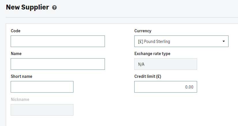 A disabled text field on a new supplier screen
Lets now look at setting up an action to enable the component.
Actions
In order to enable the component, we can simply create an action:
  "actions": {
    "enableNickname": [
      {
        "set": {
          "properties": {
            "spare_text_1": {
              "disabled": false
            }
          }
        }
      }
    ]
  },
In the above example, we have created an action called enableNickname, which simply sets the disabled property of the text field component (spare_text_1) to false.
We can then call this action in an event such as onLoad when we open a screen such as new-supplier.
Calling actions
We can now add to our existing onLoad event to make a second call, specifically for a given screen, in this case the purchase/new-supplier. We do this by adding a new pages section inside a new event object, and then hooking into the onLoad event again calling the action we created, enableNickname:
  "events": [
    {
      "onLoad": [
        {
          "set": {
            "pageExtension": {
              "componentId": "short_name",
              "panel": "bottom",
              "uiExtension": "Nickname"
            }
          }
        }
      ]
    },
    {
      "pages":[
        "purchase/new-supplier"
      ],
      "onLoad":[
        {
          "action": "enableNickname"
        }
      ]
    }
  ]
The first event object in the array adds and positions the uiExtension, and the second defines the page, and event we want to hook into.
We specify on the purchase/new-supplier screen, during the onLoad event we will fire the action enableNickname which we specified earlier.
When we load the screen, we now see the field enabled, and consistent with the existing component behaviour:
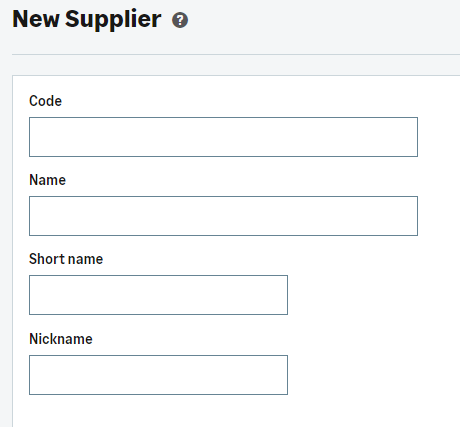
An enabled text field on a new supplier screen
Validations
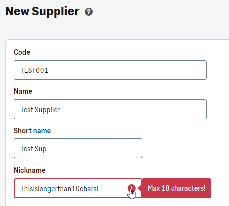
We should also look at adding some validation to the new component we’ve added. In this case lets prevent the user from adding a nickname more than 10 characters long.
We can achieve this by setting a constraint on the maximum number of characters you can pass into the text box:
  "validations": {
    "errors": [
      {
        "field": "spare_text_1",
        "type": "string",
        "constraints": {
          "max": {
            "value": 10,
            "message": "Max 10 characters!"
          }
        }
      }
    ]
  },
Now if you try to add a nickname thats longer than 10 characters an error is shown to the user:
One final issue we still have, is that if we go to the purchase/amend-supplier screen, and choose a supplier, our nickname field is still not enabled. Let’s now look at how we can fix that.
onStateChange
We can do this by returning to our events section, and this time hooking into the onStateChange event. This allows us to monitor for changes in the state of a component.
Our events section now should look like this:
"events": [
    {
      "onLoad": [
        {
          "set": {
            "pageExtension": {
              "componentId": "short_name",
              "panel": "bottom",
              "uiExtension": "Nickname"
            }
          }
        }
      ]
    },
    {
      "pages": [
        "purchase/new-supplier"
      ],
      "onLoad": [
        {
          "action": "enableNickname"
        }
      ]
    },
    {
      "pages": [
        "purchase/amend-supplier"
      ],
      "onStateChange": [
        {
          "watchTarget": "name",
          "onChange": [
            {
              "if": {
                "ne": [
                  {
                    "get": {
                      "state": "name"
                    }
                  },
                  {
                    "string": {
                      "value": ""
                    }
                  }
                ],
                "then": [
                  {
                    "action": "enableNickname"
                  }
                ],
                "else": [
                  {
                    "set": {
                      "properties": {
                        "spare_text_1": {
                          "disabled": true
                        }
                      }
                    }
                  }
                ]
              }
            }
          ]
        }
      ]
    }
In the provided code example, we engage with the onStateChange event, where we monitor changes to a specific element on the screen, in this cass the name of the supplier. In response to these changes, detected through the onChange event, we implement conditional logic:
- if the name is not equal (ne) to an empty string (“”), we execute the enableNickname action, mirroring our previous action on the new-supplier screen.
- Conversely, in the else scenario, we take action to disable the field.
In practical terms, this means that upon the loading of the amend-supplier page, the field will remain disabled until a supplier is selected, the name is updated, and only then will the field become active, contributing to a dynamic and responsive user interface.
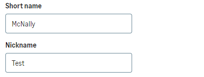
This then corrects the issue and on the amend-supplier screen once a supplier has been selected, the component activates like the default ones.
Congratulations! You now have a working web extension that adds a textbox to multiple screens, writes back to the database using the a spare text field, utilising events, and even includes validation.
Feel free to download a copy of the fully completed schema file used in the example.
Next - Next steps